Living documents and interactive schematics
Using LLMs to turn static figures from data analysis, schematics, and publications into interactive widgets as tools for thought
Living documents, living science
Something that’s delighted me about playing with LLMs in the last six months or so is using them to build interactive apps that explore concepts related to my research so I can understand them better. I haven’t seen this feature discussed much, so I wanted to share an example of the process here. It’s a strange time for science, and I’m grappling with both excitement and worry about agentic AI, but this is one of the applications I’ve found to be fun, stimulating, and useful.
I’ve long been a fan of interactive articles, live documents, and Explorable Explanations, and still remember this explainer of Kernel Density Estimation written with the markup language Idyll, shared in a lab slack years ago. Over the years I’ve often dreamt of being able to click into a figure in a journal article, drag around parameters and switch inputs, and see live results. What happens when you change a filtering threshold? What gene is responsible for that outlier point in the figure? Can I zoom into some genomic tracks showing sequencing data to better inspect the signal?
There have been several solutions for building such interactive visualizations on the web. In data analysis, I’ve found lightweight interactive plotting tools like plotly very useful. Here’s an easter egg from the code repo for our fetal atlas paper, using ggplotly, which allowed me to visualize the in silico predicted accessibility associated with moving transcription factor motifs around relative to each other, for each of the dozens of motif pairs we tested. The Shiny framework for R and Python is another alternative - I view plotly as more tightly focused on data visualization, but Shiny could definitely be used for similar types of conceptual simulations. These can be time-consuming and difficult to build, though, usually requiring familiarity with a new language or framework. Distill was a very interesting effort, an online journal for interactive publications in machine learning. But one of the reasons for their indefinite hiatus was the effort required to create such rich visualizations:
… we don’t believe that having a venue is the primary bottleneck to authors producing more Distill-style articles. Instead, we believe the primary bottleneck is the amount of effort it takes to produce these articles and the unusual combination of scientific and design expertise required.
Maybe LLMs can help us address this bottleneck?
In my own work, I’m interested in the usefulness of these little bespoke apps as “tools for thought”, helping to build my intuition. In their essay Transformative Tools for Thought, Michael Nielsen and Andy Matuschak describe a mnemonic medium which can help users better remember what they read. Their prototype was a browser-based textbook about quantum computing which has embedded questions and quizzes as well as built-in spaced repetition to prompt users to come back and recall what they learned. They discuss an interactive essay by the economist Peter Norvig which is an interactive Colab or Jupyter where users can actually see, update, and run code and then visualize the results:
For a reader to extend or interrogate the results would require total mastery of the material, and a high level of mathematical competence. But in the notebook format it’s much easier for the reader to experiment. Their exploration is scaffolded, they can make small modifications and see the results, even the answers to questions Norvig did not anticipate. This kind of scaffolded exploration is a way to build up their own understanding, and perhaps even push the frontiers of knowledge.
I’m especially interested in this last part: what kinds of media can build understanding and intuition?
And how could scientific publications incorporate these media? OpenRxiv recently launched their Labs program for experimenting with “ambitious approaches to research communication”, and I’ll be curious to see how future experiments break out of the PDF format. I know there’s a tension here where many of us, myself included, still prefer to read papers as PDFs, often in some other app. But perhaps there’s room for both especially if LLMs lower the barrier to entry to creating these visualizations; perhaps we can more easily make these for ourselves rather than depending on the infrastructure of a journal to deliver them. There are tons of examples of using LLMs to summarize literature, but I’ve been more drawn to how these tools can enrich papers and science trapped in PDFs, which are essentially the media of record for how we communicate science.
An example with Gemini Canvas mode
In this vein, I’ve been playing with using LLMs to “bring alive” paper figures and schematics to make them interactive. I first got a taste of the utility of LLMs for making interactive apps with Gemini’s Canvas mode, where it will build you an app directly in the window.
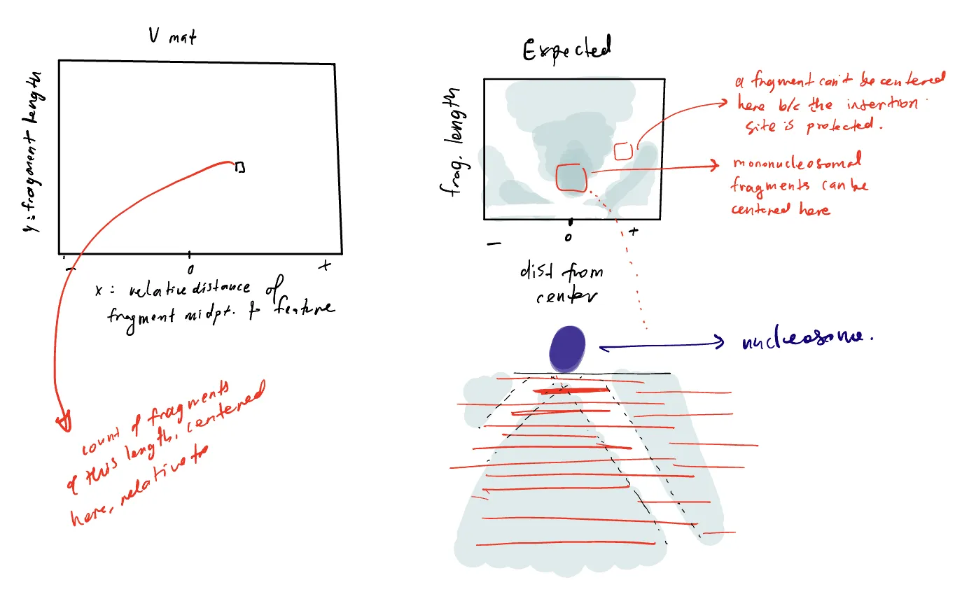
For example, recently I was trying to make sense of ATAC-seq data. Quick background: ATAC-seq reads out sites in DNA which are physically accessible to cleavage by an enzyme, resulting in fragments of DNA. If DNA at a particular site is protected due to binding of a protein like a transcription factor, it won’t be accessible to cleavage, so we won’t observe fragments with starts and ends at that site. V-plots Henikoff, J. G., Belsky, J. A., Krassovsky, K., MacAlpine, D. M., & Henikoff, S. (2011). Epigenome characterization at single base-pair resolution. PNAS, 108(45), 18318–18323. https://doi.org/10.1073/pnas.1110731108 are a visualization tool to interrogate enrichment and depletion of DNA fragments of specific lengths around specific genomic features.
First, I sketched out the expectation. The x-axis is position of fragment midpoint from some feature of interest, the y-axis is the fragment length, and each pixel gives the count or density of fragments of length centered at position . When a transcription factor or nucleosome protects DNA from cleavage, the V-plot shows a characteristic V-shaped pattern of depletion of signal.
I handed it to Gemini with a specification about which parameters I wanted to be able to alter (transcription factor or nucleosome, read density, footprint size of the transcription factor) and suddenly I had something I could engage with. Gemini builds, renders and opens React app in a new window next to the chat (this was a bit mind-blowing!), and I iterated a few times. Canvases come with shareable public links, so you could stop at that, and already have a useful interactive artefact.
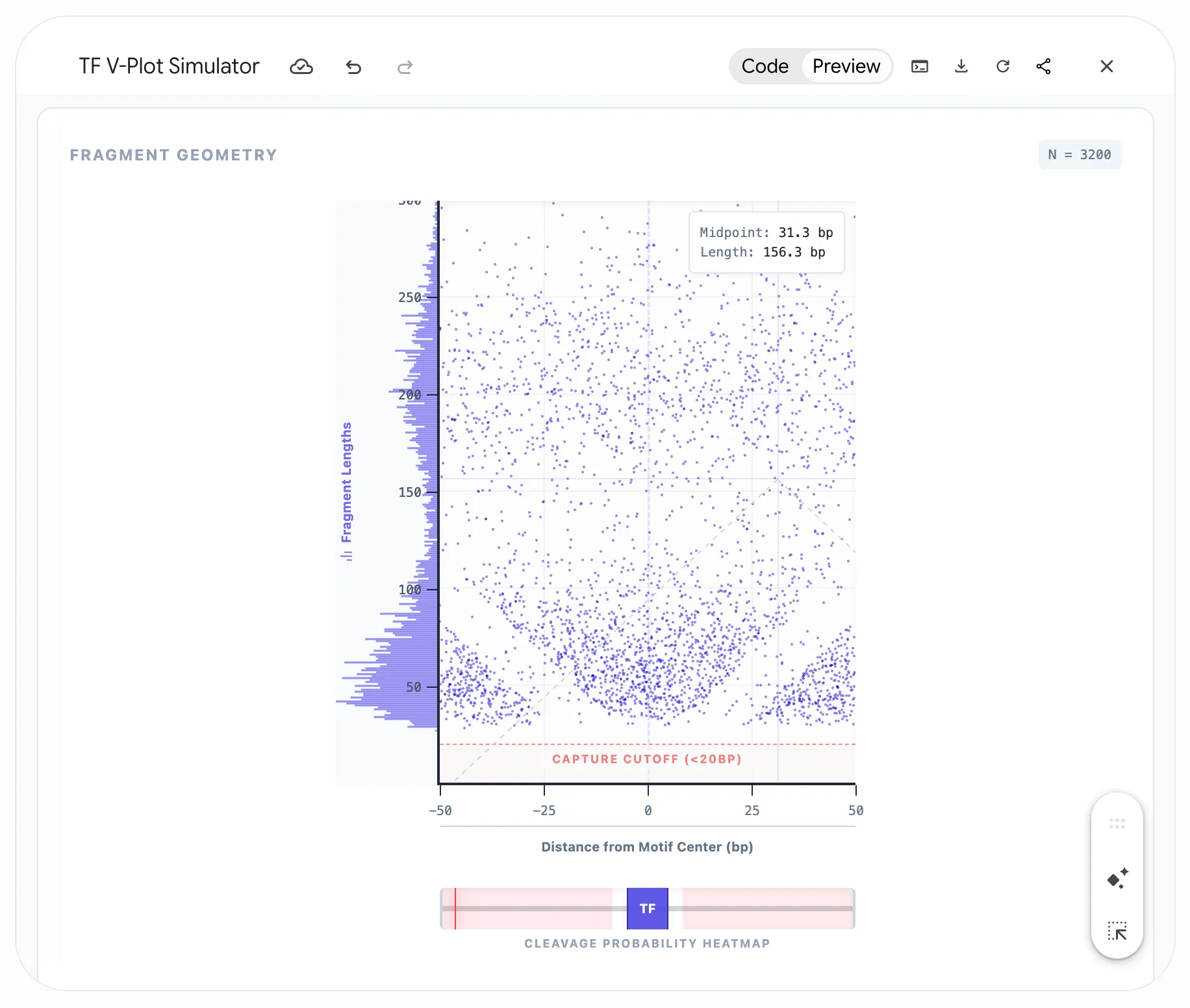
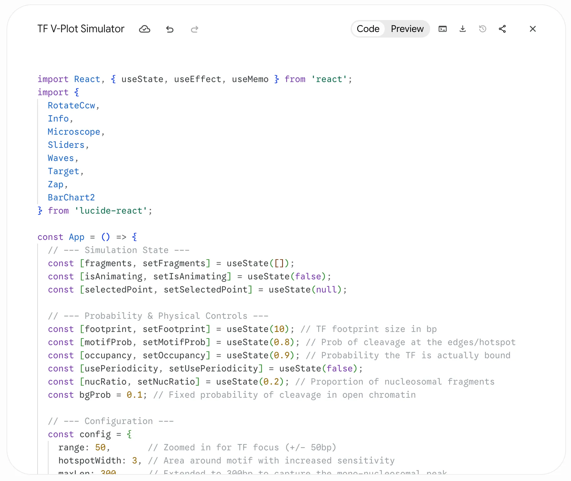
But Gemini also provides the code for its React app, so I then used Claude Code to build a stanlone app that served with GitHub Pages here: https://sjessa.github.io/vplots/ (code here). Finally, I used Claude Code to port over the standalone app to my site, making it directly embeddable in this post so I can interleave the widget and the writing.
Click on the V-plot to test validity of a fragment of a certain length at a certain position
Here, you can use the widget to simulate binding of different proteins on DNA (a transcription factor with a specific footprint size, or one or more nucleosomes), and see the expected V-plot pattern as sequencing depth increases. I’ve built in the expected ATAC-seq global fragment length distribution. Click on the V-plot to visualize the specific fragment with that length and midpoint to see whether it’s a valid fragment (i.e. could arise from Tn5 insertions in accessible DNA), or not (if DNA at that site is protected, preventing insertion).
The best part was this gave me a platform to test hypotheses about different types of bias that could produce unexpected patterns in the V-plot, ultimately helping me solve a problem in my work.
Thinking with widgets
There’s an argument to be made that just as writing is thinking, modeling and the act of programming are thinking too. Here I’ve abstracted away the process of sampling reads which combines the cleavage probabilities around the protein and the global fragment length distribution. Knowledge is fractal that way…
I think it depends on the goal. I keep a scratch repo Mine is messy and private, but it is not dissimilar to Peter Norvig’s pytudes - études he uses to develop a programming skill. What a perfect name. for Jupyter notebooks that I write when I need to pick up data and try something out, reason through a method or algorithm, plot in different ways, and so on. But these apps can be particularly useful when the goal is really to understand how some phenomenon or system changes under different conditions or parameters. Bret Victor wrote something similar in his original essay on Explorable Explanations on the example of a digital filter:
many authors would consider the equations enough. But we care about the filter’s dynamic behavior — how the response changes as we vary the parameters and — and two static examples give us little insight.
He details a few more benefits of these interactive essays: developing intuition about the phenomenon, being able to ask questions the author didn’t intend, being able to verify written claims. That ties back into the utility of these apps for scientific work.
There’s a postscript to that essay clarifying that these Explorables were really intended to refer to argumentative writing that derives strength from the inclusion of interactive diagrams, not just explanatory material, and to describe a dialogue in a way between author and reader. And that makes me realize I’m actually talking about these interactive widgets primarily for writing to myself: building my own intuition, asking questions I hadn’t thought about at the outset, verifying my own hypotheses and claims.